Writing a habit tracker, part 26: Making it somewhat usable
Allright, hahabit is now online, and as the first user I must say… it’s pretty terrible, usability-wise. On desktop, it’s kinda minimalistic cute, but on the phone, where I’d like to mostly track my habits please, it’s a disaster. I have to zoom in just to click a button.
I’d love to embed a screen recording here of just how hilariously bad it is, but I’m not sure I’m going to spend my time on that.
It was quite a few years since I last did some web work, and things have changed. I’m not sure if I’ve even ever done anything that had to be mobile friendly. What I’m finding out quite quickly by googling around is that you want to have this line in the <head> section or everything will suck:
<meta name="viewport" content="width=device-width, initial-scale=1">
So, cool, I’m adding that.
But I also want some… style. And I would love to not do much of it myself. I’d really want to just use some Standard Framework that makes things look standard and reasonably nice.
I’m looking at the login screen that I get by default from Spring Boot. That looks nice enough! What does that use? It appears to be using Bootstrap. I remember that, that’s been around for some time. But the current incarnation feels a bit… bloated?
So I’m looking around for some lightweight CSS frameworks. I’m trying Bootstrap – which does seem to still be the most popular one – and also a few others, but the one that seems to out-of-the-box most closely match what I had in mind is Pico.css, so I’m going with that for now.
Also, I’m learning about “new” semantic markup tags like main and section. Nice.
For now I’ll just repeat a bunch of stuff between my two views (home and habits); I’ll learn later how to use page layouts and includes.
This will do for now – I’m realizing that to get the design I sort of have in mind, I’ll have to do some custom CSS work. I’m not sure that’s what I want to focus on. Maybe. I’m thinking I might want to maybe instead write a native iOS client. Or add some visualizations of the progress so far. Or something else. Who knows what the future might bring!
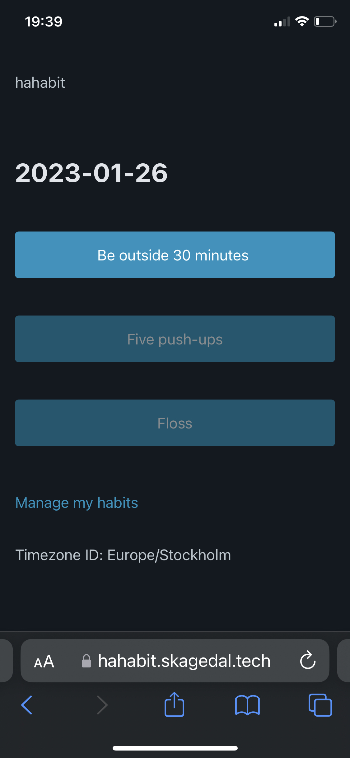
Allright then, you get a screenshot.

(Yeah, “done” is visualized as “disabled”. Not very reinforcing, perhaps.)